
Simple sparkline chart with MPAndroidChart
If your app has anything to do with numbers there's a big chance that at some point you will need to visualize those numbers with a chart. There are many libraries for Android out there. But most of them are either not maintained anymore or don't have enough activity to inspire confidence about their future.
I think the most popular open-source charting library for Android is MPAndroidChart. With 31k+ stars in GitHub and quite a few questions in StackOverflow, I think it will be around for the foreseeable future. The popularity is probably due to the variety of supported chart types (line chart, bar chart, pie chart, you name it) and to the excellent (but kind of long) documentation.
There are a few other promising libraries (e.g. Spark) but I decided to go with the flow and stick to the popular and tested choice. In this post, I will explore how to make a simple sparkline chart using MPAndroidChart. Think of it as a quick start for the library.
Setup
You would need to add a new repository in your project-level build.gradle.
repositories {
    maven { url 'https://jitpack.io' }
}Then add the actual dependency in your module-level build.gradle (check out the project site for the latest version).
dependencies {
    implementation 'com.github.PhilJay:MPAndroidChart:v3.1.0'
}Viewport
After syncing, you can refer to the MPAndroidChart view in your XML.
<com.github.mikephil.charting.charts.LineChart
    android:id="@+id/chartView"
    android:layout_width="match_parent"
    android:layout_height="match_parent"
    android:layout_margin="16dp" />
This will be the viewport where the chart will be drawn.
Customize viewport
For creating a sparkline, we need to customize the viewport by changing some of the default settings.
with(chartView) {
    // (1)
    axisLeft.isEnabled = false
    axisRight.isEnabled = false
    xAxis.isEnabled = false
    legend.isEnabled = false
    description.isEnabled = false

    // (2)
    setTouchEnabled(true)
    isDragEnabled = true
    setScaleEnabled(false)
    setPinchZoom(false)
}
In (1) we hide all the axis, hide the description and the legend. Necessary for every sparkline.
(Optional) In (2) we enable drag but disable all scaling, pinching, and zooming. This is needed for showing a small label when a data point in the chart is selected. The dragging is needed for allowing the selection to be changed dynamically while the finger is moving.
Dataset
The library has an Entry data type that represents a single data point in the graph. You need to convert from whatever format you hold your data, into a List<Entry>, with each entry defining an X and Y (as Float).
val entries =
    myData.map {
        Entry(
            it.timestamp.toFloat(),
            it.value.toFloat()
        )
    }
Customize dataset
Similarly to how we customized the viewport, you can customize the dataset. Whatever you want to change in the line itself (e.g. color, width) is defined here.
val dataSet = LineDataSet(entries, "Unused label")
    it.color = Color.BLACK
    it.valueTextColor = Color.GRAY
    it.highLightColor = Color.RED
    it.setDrawValues(false)
    it.lineWidth = 1.5f
    it.isHighlightEnabled = true
    it.setDrawHighlightIndicators(false)
}
This is a sample config that sets different colors for different states, make the line thicker, and disables highlight indicators (orthogonal lines that meet at the highlighted point).
Render
Finally, set the dataset in the chart and call invalidate(). Every time you change the chart data, you would need to call this for the chart to refresh.
chartView.data = LineData(dataSet)
chartView.invalidate()
(Optional) Marker
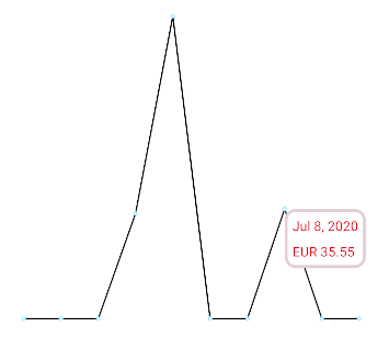
A marker is a small "popup" view that appears when a user clicks on a data point on the graph. This is useful, especially in a sparkline with no axis and labels, to show the exact value of the data point.
The library provides all you need for this functionality. You only need to extend MarkerView to provide a layout file for your marker (i.e. the "popup" view) and the logic for updating the values.
class MyMarker(context: Context) : MarkerView(context, R.layout.my_marker) {

    override fun refreshContent(entry: Entry, highlight: Highlight) {
        super.refreshContent(entry, highlight)
        dateView.text = formatDate(entry.x.toLong())
        valueView.text = formatCurrency(entry.y.toLong())
    }
}
chartView.marker = MyMarker(context)That's it! Now you have a simple sparkline chart with the (optional) ability to highlight some values (and works even while dragging). Happy charting!