

Jetpack Compose: intro & basic layouts
Jetpack Compose is the latest and greatest way of designing UIs in the Android world. It offers a declarative way of building UIs using only Kotlin code. This is a big departure from the XML-based views.
From my brief encounter with the new UI toolkit, I have only positive impressions. You need to write way less code to design UIs and you don't have to jump back-and-forth between XML and Kotlin. Although data binding existed before, the new toolkit makes the UI-updated-automatically-based-on-your-data the main way of thinking, not just an optional library. Finally, the new almost instant preview functionality accelerates the development workflow significantly.
At the time of writing, Jetpack Compose is in alpha. Changes are expected but I think the API is pretty stable by now. This will be an exploratory series of posts that will explore the new toolkit. Expect an introduction to the main parts of the toolkit, but don't expect a deep dive on any specific part. Perfect if you just want to see an overview of how & what can be achieved with the hottest kid in town.
Set up
To play with the new toolkit, you will need Android Studio Canary at the moment. Don't worry, you can have the stable and canary versions of the studio both installed (if you have enough disk space). Follow this to create a new Compose project.
In case you want to use Compose in an existing project, you will need to add some additional dependencies and install the Compose compiler plugin. Just a reminder that it is not recommended to use Compose in production yet.
Basics
I will use the following example (maybe the simplest Compose UI you can create) to go through the basics of the toolkit.
class MainActivity : AppCompatActivity() {
    override fun onCreate(savedInstanceState: Bundle?) {
        super.onCreate(savedInstanceState)
        // 1.
        setContent {
            Demo("Hello world")
        }
    }
}

// 2.
@Composable
fun Demo(text: String) {
    // 3.
    Text (text = text)
}

// 4.
@Preview
@Composable
fun PreviewDemo() {
    Demo("Hello world preview")
}- It's the familiar
setContent()that used to accept an XML layout resource id. Now it accepts a "composable" function (see next point) that is responsible for drawing the UI. - "Composable" functions are marked with
@Composableand can only be called from other composable functions (andsetContent()). Jetpack Compose has a Kotlin compiler plugin that converts these "composable" functions into UI elements. Text()is a "composable" function that's built-in the toolkit. As the name suggests, it will draw the passed string on the screen.- One of the coolest features of Jetpack Compose: live previews! No need to deploy the app to view how it looks. Just annotate with
@Previewand Android Studio will show you the result. The only limitation is that the composable function should not take any parameters. That's why it's best practice to have dedicated preview functions such as this one. Every time you make a change and save, the preview will be updated.
Layouts
To create a real-world UI, you would need multiple elements. But how do you instruct Compose where to put each element? You used to have RelativeLayout, LinearLayout, ConstrainLayout, etc. In Compose you just have 3 standard layout components: Column, Row, Box.
Column
Put each element below each other. Similar to LinearLayout on horizontal orientation.
@Composable
fun Demo(text: String) {
     Column {
        Text("This is")
        Text("below each other")
    }
}
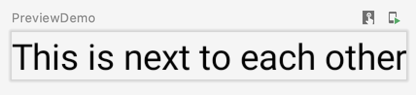
Row
Put each element next to each other. Similar to LinearLayout on vertical orientation.
@Composable
fun Demo(text: String) {
     Row {
        Text("This is")
        Text("next to each other")
    }
}
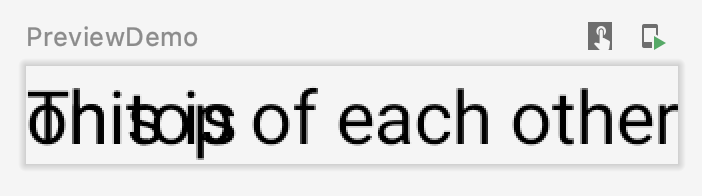
Box
Put each element on top of each other. Similar to FrameLayout.
@Composable
fun Demo(text: String) {
     Box {
        Text("This is ")
        Text("on top of each other")
    }
}
In theory, using these standard layouts you can create almost any kind of UI. You don't have to worry about deep nesting since Compose can handle this efficiently (in contrast with the old View-based UIs). Of course, there are more powerful layouts available (such as the ConstraintLayout) but it's outside the scope of this post.
Scrollable
But what if you have thousands of elements? Drawing all of them is inefficient and slow. Use LazyColumn or LazyRow. Nothing that's not on the screen will be drawn. No need for RecyclerAdapter.
@Composable
fun Demo(text: String) {
    LazyColumn((0..1000).toList()) {
        Text("This is $it")
    }
}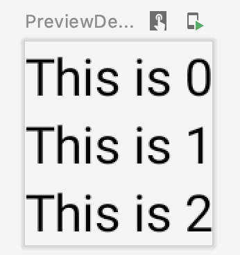
Check this for a primer on lists in Compose.
This scratched the surface of the Jetpack Compose. Hopefully, by now you have a grasp of how the toolkit works and how you can use it to arrange elements around. I will continue exploring the library with more similar exploratory posts. Happy UI drawing!
Check out more in this Jetpack Compose exploratory series:
 Bevan Steele
 Bevan Steele